, here are tutorials for the following icons. All were created in Adobe Photoshop CS5. Note: I didn't save any of the original PSD files, so these are all recreations.
| 1. Here is our cap from Fishstick Theatre. It's not the very same cap that was used for the original icon but I couldn't find the exact one — I think it may have been from Rawr Caps — so I went with the closest I could find. First thing I did here was crop, and that's our base on the right. |
 |
| 2. Duplicate the base twice. Set the first duplicate (bottom) to Soft Light and the second duplicate (top) to Screen. |   |
| 3. This part is completely unnecessary, it's just me being an obsessive perfectionist. To try and make this better resemble the original icon, I used to smudge tool on the bottom right corner to define the line between Annie's hair and the background. I did this in a new layer, after stamping all visible layers. (On Mac, the shortcut is COMMAND + OPTION + SHIFT + E.) |  |
| 4. More unnecessary attention to detail! Here, I created a new layer and brushed some black over the bottom right corner, then set the layer to Soft Light. If I recall correctly, it was a small drop shadow brush at 100% but I later lowered the opacity of the entire layer to 64%. On the right is the Soft Light layer alone, then what it should look like as part of the whole. |   |
5. New Adjustment Layer » Color Balance. This creates a very slight shift toward more yellow.
MIDTONES: +4, 0, -5
SHADOWS: 0, 0, 0
HIGHLIGHTS: 0, 0, -4 |  |
6. In a new layer, paste this texture from ![[personal profile]](https://www.dreamwidth.org/img/silk/identity/user.png) nailbites. Set the layer to Screen. I dragged the layer a little bit higher and toward the left to get the lighting right where I wanted it (or to match the original icon, I don't even remember anymore). nailbites. Set the layer to Screen. I dragged the layer a little bit higher and toward the left to get the lighting right where I wanted it (or to match the original icon, I don't even remember anymore). |   |
| 7. Create a new layer. Use the brush tool — small, round drop shadow brush — to add streaks of light where the icon feels lacking. I did this at 100% opacity and the color I used was #C17E49. Once I had my streaks where I wanted them, I applied Motion Blur (Filter » Blur » Motion Blur) at a 0° angle. I don't remember the exact distance; I usually just drag the arrow back and forth until it looks right in the preview. Finally, set this layer to Screen. |   |
8. New Adjustment Layer » Vibrance. Set this layer to Soft Light, with the following settings:
VIBRANCE: +100
SATURATION: +56 |  |
| 9. Stamp all visible layers. With the top, stamped layer selected, head to Filter » Blur » Gaussian Blur. I don't remember the exact Radius but I've included the blur layer on its own on the right. Again, I always play around with the little arrow until it looks right to my eye. Once Gaussian Blur has been applied, set this layer to Soft Light. Play with the opacity as you see fit; for this one, I left it at 100%. |   |
is what my layers look like.
| 1. The original icon was made from a DVD screencap. However, I didn't have the DVD on hand when I made this recreation so I used a screenshot from Netflix instead. On the right is our base, cropped and ready to go! |
 |
| 2. Duplicate the base. With the duplicate layer selected, go to Image » Auto Tone. |  |
| 3. Duplicate the base layer again, then drag this layer to the top. Desaturate the layer (the Mac shortcut for this is COMMAND + SHIFT + U). Set this layer to Soft Light and lower the layer opacity to 20%. This last part comes courtesy of my OCD and is not necessary, but I'm including it in case anyone should want to follow along precisely! I just added a layer mask and did some erasing. I've included what my mask looks like on the right for reference. |   |
| 4. Create a new layer and with the brush tool at a low opacity, color in around the corners and anywhere else you feel that light is needed. Set this layer to Soft Light. I've included this layer on its own on the side for reference, but note that the black background is not a part of the original layer! It's just added for the sake of this tutorial because otherwise we'd just have white on white. |   |
5. New Adjustment Layer » Selective Color. Like in the above tutorial, this change will be very slight, so don't worry if you can't see the difference!
WHITES: 0, 0, +7, +35
NEUTRALS: +5, +1, -1, +1
As you can see on the right, I erased a small portion of this layer in the mask. |   |
6. New Adjustment Layer » Color Balance.
MIDTONES: +16, +2, +8
SHADOWS: +4, +6, +1
HIGHLIGHTS: 0, 0, 0 |  |
7. New Adjustment Layer » Vibrance.
VIBRANCE: +100
SATURATION: +46
Lower this layer's opacity to 90% and use the layer mask to erase any parts where the colors look too strong. |   |
8. New Adjustment Layer » Brightness/Contrast. Set this layer to Soft Light, with the following settings:
BRIGHTNESS: +30
CONTRAST: +12 |  |
9. New Adjustment Layer » Selective Color.
REDS: -40, -7, +65, 0
YELLOWS: -56, -10, +100, +23
GREENS: +100, -0, +100, 0
CYANS: +100, +100, -100, +65
BLUES: +100, +100, -100, +100
MAGENTAS: -9, +57, -53, -15
WHITES: +2, +100, +35, -18 |  |
10. New Adjustment Layer » Levels. Only adjust the RGB settings!
OUTPUT: 19
INPUT: 1.03
Again, I used the layer mask to erase some some parts where the contrast was too strong for me.
|   |
11. New Adjustment Layer » Vibrance. Set this layer to Soft Light.
VIBRANCE: +100
SATURATION: -45
Select the layer mask and slowly erase from the center of the icon until it's to your liking. |   |
| 12. Paste this gradient in a new layer, set that layer to Soft Light and lower the opacity to 30%. |  |
| 13. New Adjustment Layer » Photo Filter. Click the Color radio button and choose a red-orange tone. I used #EA1A1A. Make sure that Density is set to 25% and that the Preserve Luminosity option is checked. |  |
| 14. Stamp visible layers. Filter » Other » High Pass. Set the Radius to 0.3 pixels and apply. Set this layer to Soft Light. |  |
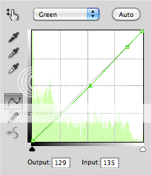
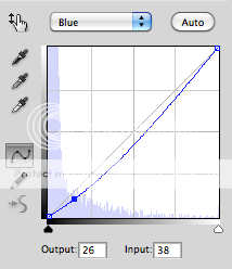
15. New Adjustment Layer » Curves. Set the opacity to 50%. Keep in mind that when I specify point one, point two, and so on, I'm talking about new points we're adding to the grid. Do not move the existing points in either corner!
RGB, POINT ONE: Output: 43, Input: 34
RGB, POINT TWO: Output: 196, Input: 183
RED: No Adjustments!
GREEN, POINT ONE: Output: 129, Input: 135
GREEN, POINT TWO: Output: 219, Input: 220
BLUE, POINT ONE: Output: 26, Input: 38 |  |
is what my layers look like.
| 1. As with the last tutorial, this icon was made from a Netflix screenshot, but this time, that's the case for both the original and the recreation. That's probably why this is (at least to my eye) the closest looking recreation. I've found that for Buffy the Vampire Slayer caps especially, Netflix Instant captures have much more neutral coloring than DVD caps, which typically already come with a dark yellow tint. Compare this shot from Netflix (excuse the quality, it takes forever to load HD on my home connection) with this cap from Pretty As A Picture. Anyway, on the right, you'll find the cropped base. |
 |
| 2. Duplicate the base twice, set both to Screen. Leave the first Screen layer at 100% opacity, lower the second Screen layer to 10% opacity. |  |
| 3. Select the base layer. Filter » Sharpen » Smart Sharpen. Set amount to 500 and Radius to 0.3 pixels. Under Remove, select Gaussian Blur. Make sure that the More Accurate box is checked. (Reference.) |  |
| 4. Above the base layer, create a New Adjustment Layer » Gradient Map. From the default gradients, select the Black, White gradient (it should be the third from the left in the Presets window). Set this layer to Soft Light and lower the opacity to 30%. |  |
| 5. Create a new layer and with the brush tool, paint some white over Buffy's hair and other areas you want to see brightened. Set this layer to Soft Light. Mine is on the right, and remember that the black background was only added for the sake of this tutorial. |   |
6. New Adjustment Layer » Curves.
BLUES, POINT ONE: Output: 25, Input: 61
BLUES, POINT TWO: Output: 191, Input: 164
From the layer mask, I erased some parts that I wasn't comfortable with. |   |
7. New Adjustment Layer » Selective Color.
REDS: -2, 0, 0, 0
YELLOWS: 0, 0, +75, 0
WHITES: 0, 0, +12, +20
On the top right, you'll see the parts I erased from the layer mask. |   |
8. New Adjustment Layer » Selective Color.
GREENS: +100, -23, +100, +100
CYANS: +100, +100, +100, +100
WHITES: 0, 0, +12, +20
On the top right, you'll see the parts I erased from the layer mask. |  |
9. New Adjustment Layer » Vibrance. Set this layer to Soft Light.
VIBRANCE: +100
SATURATION: 0 |  |
10. New Adjustment Layer » Vibrance.
VIBRANCE: +100
SATURATION: 0
Use the layer mask to erase or soften as needed. |  |
| 11. Stamp visible layers. Filter » Blur » Gaussian Blur, choose the blur Radius that you like best! Set this layer to Soft Light and play with the opacity if you wish. I left the opacity at 100%. |   |
is what my layers look like.
Please let me know if you have any difficulty understanding this or any of this raises questions! I'd be happy to answer them.
![[community profile]](https://www.dreamwidth.org/img/silk/identity/community.png) treatyoself2012-08-16 09:32 pm
treatyoself2012-08-16 09:32 pm


